In our current Swift Talk series
, we have been re-implenting parts of SwiftUI's layout system to gain a deeper understanding of how it works. Last week we examined SwiftUI's grid views and re-implemented their layout algorithm. Some parts of the behavior really surprised us.
A few days ago we tweeted a series of layout quizzes
for SwiftUI's LazyVGrid
to highlight some of the less obvious behaviors. In this post we'll take a look at all three quiz questions and explain why the grid lays out its contents in the way it does.
Interestingly, we were not the only ones struggling to understand the behavior of grids: none of the most popular quiz answers were correct!
#1: Fixed and Adaptive Columns
The first example defines a grid with a fixed and an adaptive column. The grid has a fixed width of 200 points:
LazyVGrid(columns: [
GridItem(.fixed(70)),
GridItem(.adaptive(minimum: 40))
]) {
}
.frame(width: 200)
.border(Color.white)
The three solutions we asked you to choose from:
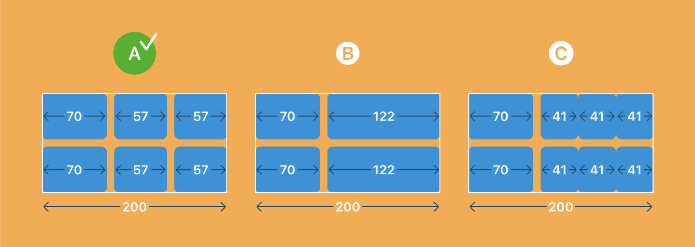
Solution A is correct.
For grids, fixed size columns are always rendered exactly at the specified width, no matter how much space is available. Therefore, the first column renders as exactly 70 points wide.
The grid subtracts the fixed column widths and the spacing between columns (which is the default spacing of 8 points) from the proposed width (which is 200 points in this example), leaving us with a remaining width of 122 points. This width is then distributed to the remaining columns. In this case there's only one column left, an adaptive column, so it takes up the remaining width of 122 points.
Adaptive columns are special: SwiftUI tries to fit as many grid items as possible into an adaptive column; it divides the column width by the minimum width, taking spacing into account.
In our example above, we have a default spacing of 8 points, and we can fit two columns (40 + 8 + 40) into the 122 points. Trying to fit three columns (40 + 8 + 40 + 8 + 40) fails. The adaptive column has an effective width of 122 minus 8, giving 114 points to distribute. Dividing 114 points by the number of columns gives us two items that are 57 wide.
#2: Flexible and Adaptive Columns
The second quiz has a grid with a flexible and an adaptive column:
LazyVGrid(columns: [
GridItem(.flexible(minimum: 140)),
GridItem(.adaptive(minimum: 70))
], content: {
})
.frame(width: 200)
.border(Color.white)
The three potential solutions:
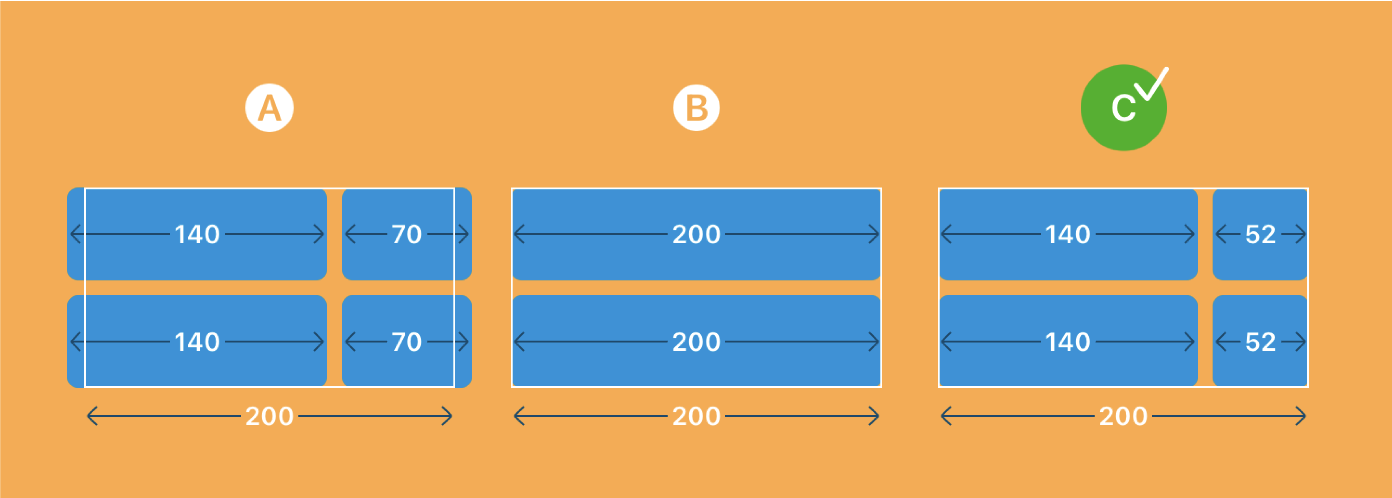
Solution C is correct.
Unlike the first example, this grid doesn't have any fixed columns, so the grid starts out with an available width of 200 points minus 8 points of default spacing between the two columns, which gives us 192 points.
Then the grid loops over the remaining (non-fixed) columns in order, and calculates each column width as remaining width divided by the number of remaining columns, clamped by the minimum and maximum constraints on the columns.
In this example, the width of the first column is calculated as 192 points of remaining width divided by 2 remaining columns, which equals 96 points. Since we specified a minimum width of 140 points for the first, flexible column, 96 points gets clamped to the range between 140 and infinity. The column becomes its minimum width of 140 points, and the remaining width is now 192 minus 140, giving 52 points.
The width of the second column is now calculated as 52 points remaining width divided by 1 remaining column, which equals 52 points. We might expect this result to be clamped to the adaptive column's minimum width of 70 points, but the minimum property of an adaptive column is only used to compute the number of items inside that column. The adaptive column thus becomes 52 points wide.
The item in the adaptive column is being rendered with a width of 52 points as well, although we've specified a minimum of 70 points. If there's less space available than the minimum item width, the minimum width is ignored and the item gets rendered at whatever width is left over.
#3: Multiple Flexible Columns
The third quiz has a grid with two flexible columns:
LazyVGrid(columns: [
GridItem(.flexible(minimum: 50)),
GridItem(.flexible(minimum: 120))
], content: {
})
.frame(width: 200)
.border(Color.white)
The three potential solutions:
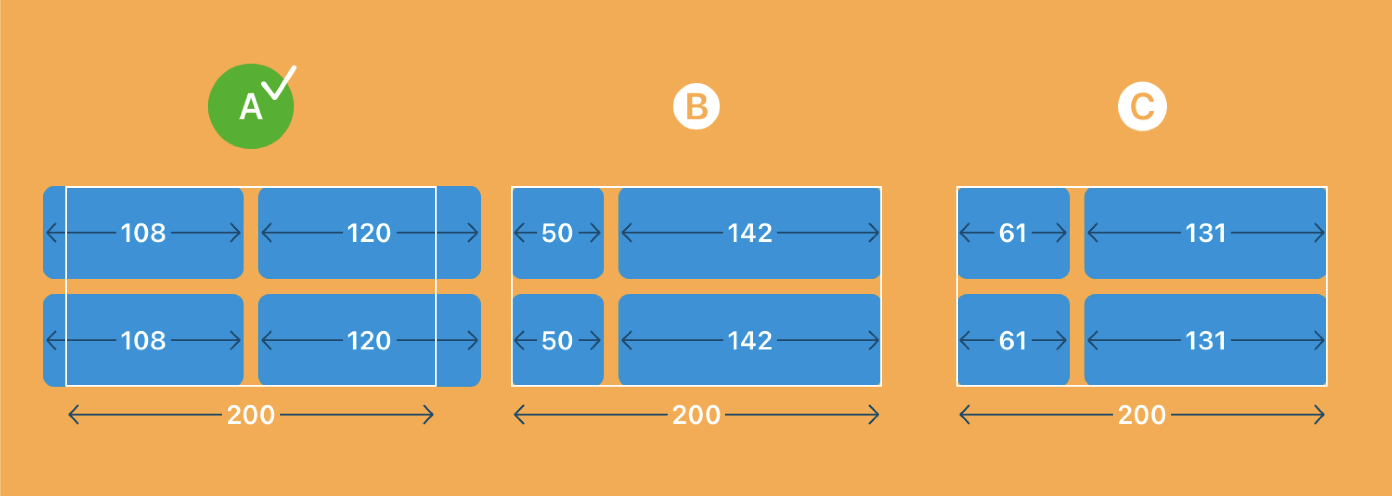
Solution A is correct.
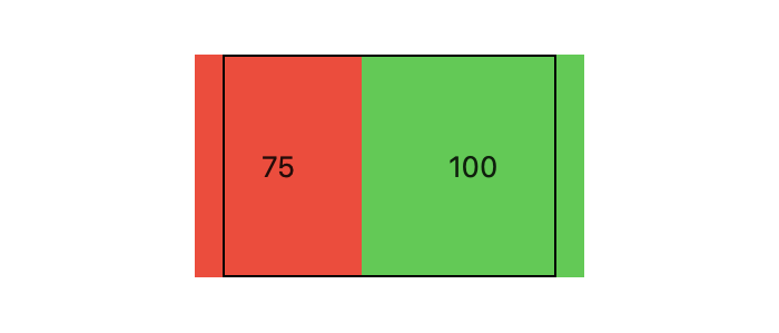
This seemingly simple layout shows perhaps the most confusing behavior of the three examples in this post. Not only does the grid render out of bounds — although the columns' minimums would happily fit into the available width of 200 points — it also renders out of center of its enclosing 200-points-wide frame.
Let's go through the steps of the grid's layout algorithm and see what's happening. We start again with a remaining width of 200 points minus 8 points of default spacing, which gives us 192 points. For the first column, we calculate the width as 192 divided by 2 remaining columns, which equals 96 points. Since the first column has a minimum width of 50 points, the width of 96 points isn't affected by the clamping, so the remaining width stands at 96 points. The second column becomes 96 points clamped to its minimum of 120 points, i.e. 120 points wide.
However, that's not what we see in the rendering of this grid: the first column renders 108 points wide, the second one renders 120 points wide, whereas we calculated 96 points and 120 points.
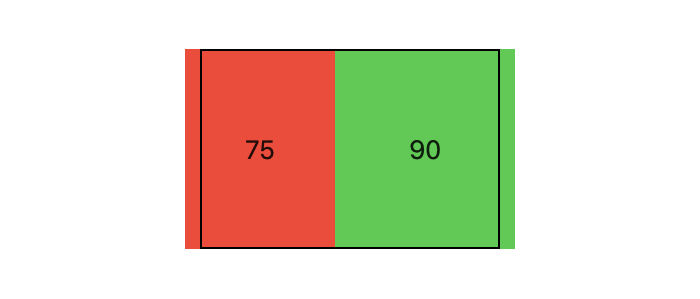
To understand this part we have to remember that SwiftUI first calculates the frames of all views, before it renders the views in a second pass. With our calculation above, the overall width of the grid is calculated as 96 + 8 + 120 = 224 points. The fixed frame with a width of 200 points around the grid then centers the grid, shifting it (224-200)/2 = 12 points to the left.
When it's time for the grid to render itself, it starts out with the width determined in the layout pass, which is 224 points, but to actually render it calculates the column widths again
based on the width of 224 points!
In this regard, grids differ significantly from stacks: stacks will remember the sizes of their children between layout and rendering, and therefore avoid this unexpected behavior, whereas grids don't seem to do that.
Let's go through the column width calculations once again, starting out with a remaining width of 224 points minus 8 points spacing, or 216 points. The first column becomes 216 points divided by 2 remaining columns, equalling 108 points. The remaining width is now 216 minus 108, giving us 108 points. The second column becomes 108 points clamped to its miminum of 120 points.
Et voilà! We've arrived at the correct column widths of 108 and 120 points.
Since the frame around the grid has calculated the grid's origin based on the original width of 224 points, but the grid now renders itself with an overall width of 108+8+120 = 236 points, the grid appears out of center by 6 points.
Conclusion
In summary, these are the steps the grid's layout algorithm takes:
-
Start out with the proposed width as the remaining width.
-
Subtract the width of all fixed width columns, as well as the spacing between columns.
-
Iterate over the remaining columns in order and
-
calculate each column's width as remaining width divided by the number of remaining columns, clamped to the column's minimum and maximum.
-
subtract the column's width from the remaining width.
Keep in mind that this algorithm runs once during layout, and then again during rendering. During layout the algorithm starts with the proposed width of the parent view, whereas during rendering it starts with the calculated overall width from the initial layout pass.
This behavior can be quite unintuitive, but we hope that this post will help you understand that behaviour better, and achieve the results you aim for.
We'll be continuing the SwiftUI Layout Explained
series through December. Each episode re-implements an aspect of the layout system, and with six episodes already released there's plenty to learn!
To support us, and access our entire catalogue, subscribe here
.